
Now that we have our own custom cloned rendering, it’s time to actually make it look how we want it to. The first step in doing this would be to head over to the auto-created template and adjust the fields as needed. Following through with the previous post, we will be continuing to create a basic Hero component, for which we will only need two fields: a background image field and a title field.
- Navigate to the Hero template at
/sitecore/templates/Feature/Experience Accelerator/Page Content/Hero - Rename the field section to Hero and update the fields according to what we defined earlier. You should end up with something similar to this:
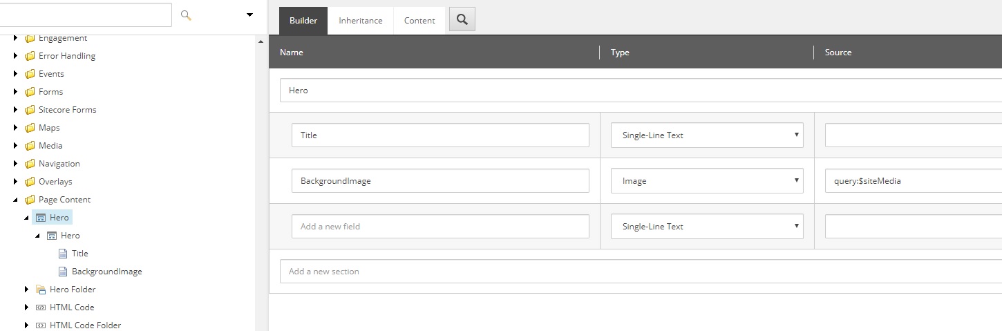
Note: Make sure to update the Title field on each TemplateField item as well! Otherwise the field title will not be correct on the template items.
Now that we’ve updated our template, we need to update our markup. For this, we’ll head over to the rendering variants folder we created in part 1, found at /sitecore/content/tenant/site/presentation/rendering variants/Hero. Before we create our rendering definition, lets take a moment to review what a rendering definition actually is.
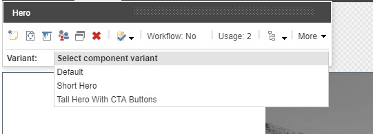
A rendering definition is a collection of sitecore items which each represent html nodes. For each of these items you can select a tag, css class, set other data attributes, and bind to a sitecore field. By then nesting these tags within eachother, you can create the markup for any component and keep it all within Sitecore. Additionally, while each component has a Default rendering variant, you can create other variants as siblings to the default variant. By doing so, a dropdown is automatically populated in the Experience Editor which allows content authors to select between variants. What this means is that you no longer have to create sometimes confusing rendering parameters for content authors to choose how to render their component on the frontend. They have simple, clearly named rendering variants from which they can choose.
If we look at the existing items, we can see that there is a Default variant definition item with two direct children, Promo Icon and Promo Text. The promo text then has it’s own children and so on. For this specific out of the box promo variant, only two templates are being used to create the definition, VariantSection and VariantField. VariantSection is a template that represents an html node but does not insert any content from a sitecore field into that node, such as a basic div or section. VarientField on the other hand is an html node which is used to insert content from your template into the node, meaning it would be used for an h1 or other text fields.
The markup we’ll be looking to create with our default rendering variant is as follows:
<section class="container component-hero" style="background-image: url(BackgroundImageField);">
<div class="hero-container">
<div class="row">
<div class="col-xs-12 col-sm-8">
<div class="hero-title">
<h1>HeroTitleField</h1>
</div>
</div>
</div>
</div>
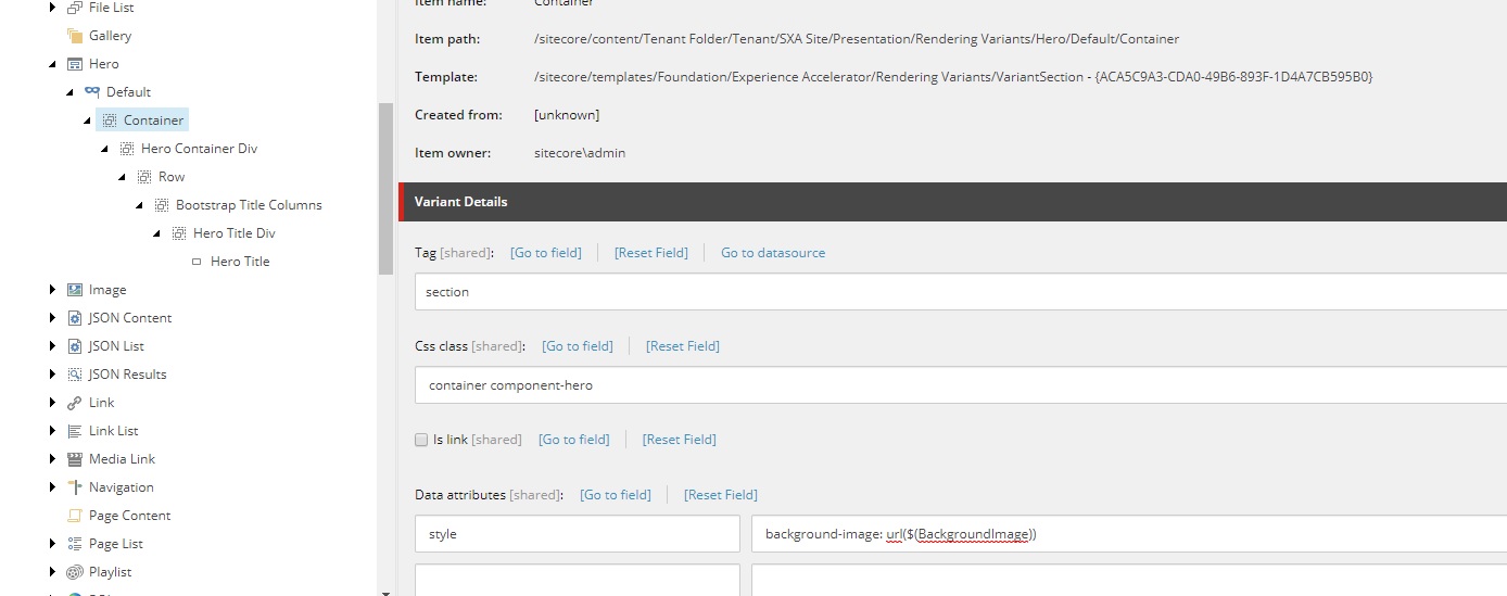
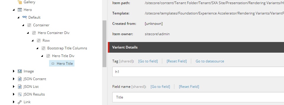
</section>To accomplish this, I’ve used 5 VariantSection items to represent each of the section/div nodes, and a single VariantField item to represent the title, which is bound to the Title field. You might be asking How did you set the background image?. Great question! You can use tokens in fields which can be leveraged to pull down fields such as an image into a data attribute. As a result,what I’ve done is set a style data attribute with value background-image: url($(BackgroundImage)). Note: For token replacements I HIGHLY recommend you use field names with no spaces. You can always set the display name with a space for content author friendliness, but I’ve had difficulty using token replacement with fields including spaces. What you’ll end up with is the following:
Great! Now I’ll just add some super barebones CSS to make it appear a bit like a hero.
.component-hero{
height: 400px;
position: relative;
background-size: cover;
}
.hero-container{
margin: auto;
max-width:800px;
}
.hero-title{
color: white;
font-size: 2em;
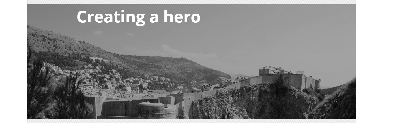
}Finally, lets go take a look in the experience editor. After we drag and drop the hero component onto the page, you should be able to inspect and see all the markup is present as we would expect it to be. The title field is hard to see because the background is white, but a bit of clicking will allow you to find the title and edit it. For the image however, we don’t have any way to edit it from the experience editor yet, so we will go in and edit the related item. After setting the image and setting the title, you should have a barebones hero as seen below. Note: By no means am I a designer, I’m just here to demonstrate the techniques.
Well done, we’ve created our first basic rendering from a promo clone. If you wanted to include this in your solution, the only file you really need to include is the view file. While we did not customize it at all in this example, it’s a good idea to have that view in case you want to customize it later. Otherwise, we did not actually create any other items outside of Sitecore. The templates, rendering, and markup is all stored within Sitecore. Isn’t that nice? In the next few posts, we’ll be looking at increasing the complexity of rendering variants, as well as creating fully custom SXA components.